Week 42: Dot plots, bullet charts, slopegraphs and more. We've updated our visualise data section!

Following up from Stephanie Evergreen's seminar on Presenting data effectively, we've been working with her to improve our Data visualisation section. We've added new charts, updated descriptions and examples, and linked to more resources to help you develop charts.
New charts
We've added 7 new charts to our data viz section:
Bullet graph
Using a target line to show progress to date, often with levels of performance graphed in the background.
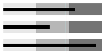
Deviation bar graph
Aligning two bar graphs along their spine to compare the shape of their data sets.
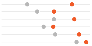
Dot plot
Plotting two or more dots on a single line for each category being compared.
Small multiples
Positioning several small graphs with the same scale in a row for easy comparison.
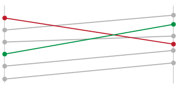
Slopegraph
Comparing change between two points in time with a line.

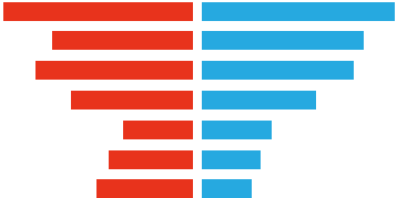
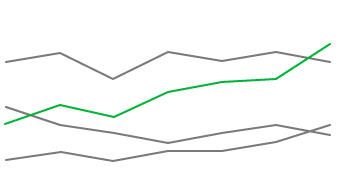
Split Axis Bar graph
Regraphing comparison between two points in time by simply graphing the change that has occurred in that time frame.
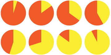
Icon array
Arranging a matrix of icons (usually 100 or 1000 icons) typically as a frequency-based representation, simultaneously displaying both the number of expected events and the number of expected non-events.
Video clips from Stephanie's seminar
We've also embedded a few clips from Stephanie's webinar on the visualise data page. These clips are great for helping you think about alternative ways to visualise your data and how simple differences between chart types can make the message behind your data more visible.
Feedback
We'd love to hear what you think about our updated data viz section. What do you find useful? What do you think can be improved? Let us know in the comments below or contact us here.
Related links
Visualise data
Data visualisation is the process of representing data graphically in order to identify trends and patterns that would otherwise be unclear or difficult to discern. Data visualisation serves two purposes: to bring clarity during analysis and to communicate.
Presenting Data Effectively: Communicating Your Findings for Maximum Impact
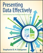
This book, authored by Stephanie Evergreen, outlines a step-by-step process for enhancing the presentation of data in reports to increase its effectiveness.
Evergreen Data
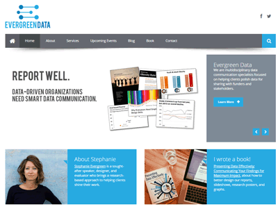
Stephanie's website with a great new look and feel. Check out her blog featuring heaps of tips and tutorials on data viz.