Editing reports for an audience

Evaluation reporting is important. While there are many innovative methods to grab your audience's attention, the evaluation report is still an important vehicle to get your key messages across.In this blog, Alice Macfarlan shares her tips for editing a report draft with an audience focus in mind.
I recently read Anne K. Emery’s blog ‘A two-hour turnaround: How to transform a text-heavy report into a visual-lite report’. It’s a great piece – it explains how some simple design tweaks, such as cover images, text-hierarchy, colour-coding, intentional page breaks and visuals, can drastically improve a report’s layout and make the content much easier to read. But it got me thinking (with a bit of misplaced jealousy) about the beauty of fiddling about with a nice, tidy, essentially finished report. I spent a lot of time last week wrestling with a not-so-tidy report. Although it contained all the essential information and components it needed, these were lost in a mess of way too many pages and words. So in the same vein of Anne’s blog, I thought I’d share some of the hacks I used to go from having the raw materials, in an unhelpful form, to a freshly baked product that just needs the finishing touches put on it.
Review what you’ve got
Possibly the step a lot of people find the hardest. Reading drafts with an objective eye is difficult. After many hours of collecting, analysing and writing up your material, it can be difficult to go back and read it thoroughly without skimming. But there are a few tricks you can use to trick your brain into making this easier.
Make it look like a different document
This sounds silly, but making small, quick changes such as adjusting the font size, adding a second column, and hiding all comments and tracked changes can help trick your brain into thinking that you're looking at something new that deserves your full attention.
Change where you’re sitting
If you’re on a deadline to get this report in, you’re possibly spending a lot of time looking at your computer screen at your desk. Try looking at it somewhere else, such as a café or couch – either by printing it or taking your laptop – and see if this helps you get in the mindset of a reader, rather than a writer.
Create a skeleton structure of what your draft currently looks like
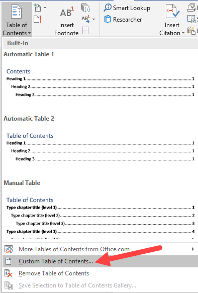
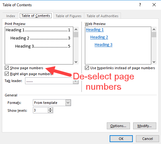
This is possibly my favourite trick for getting a handle on a really big, unwieldy draft. It’s very simple, you just make a list of all the different elements and sections in your current draft so that you can quickly get an overview of what’s in it, and think critically about what’s working and what’s not without getting bogged down by the actual content. A quick way to do this is to use hierarchical Heading Styles for all chapter, section, figure and table headings and adjust the style of the table of contents to display all these levels to get an in-depth overview.
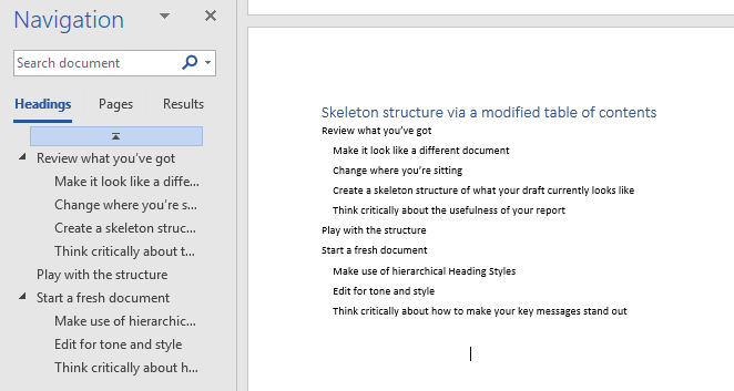
This clean skeleton structure can now be copied and pasted into a new document.
If you want an extra level of detail, you could also create very short summary headings for the content of each paragraph so you can really get a handle on what information you communicate where. Keep these as a separate heading style so that you can easily ‘Select All Instances’ of this style, and then delete when you’re finished with them.
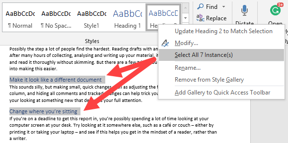
Right-click to Select All Instances of a heading to clean up after you've made your skeleton structure.
Think critically about the usefulness of your report
Try to de-personalise your relationship with your content as you re-read. It’s really important to step back from your work and stop thinking about all the hours you’ve put into it and start thinking about what your audience needs to know, and whether the report in its current form is able to tell them that.
Who is this evaluation for? What information do they need? What information is nice for them to have? And what information is unnecessary or distracting from the key messages? Hopefully, early in the evaluation process, there will have been some stakeholder mapping and communication planning around these questions that you can go back to (see an earlier blog on this for some templates to get you started). If not it’s worth sitting down at this stage and thinking this through and identifying the key messages you need to communicate.
Play with the structure
After you’ve got an idea of what you’ve got in your report, you can start thinking about what you need. Is your 78-page report with the findings starting on page 52 going to help your reader get what the information they need? Probably not. Jane Davidson provides a compelling argument for thinking critically about report structure and moving away from traditional social science report structures. Instead, think about adopting the 1-3-25 report structure (read Stephanie Evergreen’s post on the 1-3-25 structure). Or try storyboarding your report’s key sections so you can physically map out the report to see the weighting of them and how they fit together. If you do this on post-it notes you can easily move your sections around.
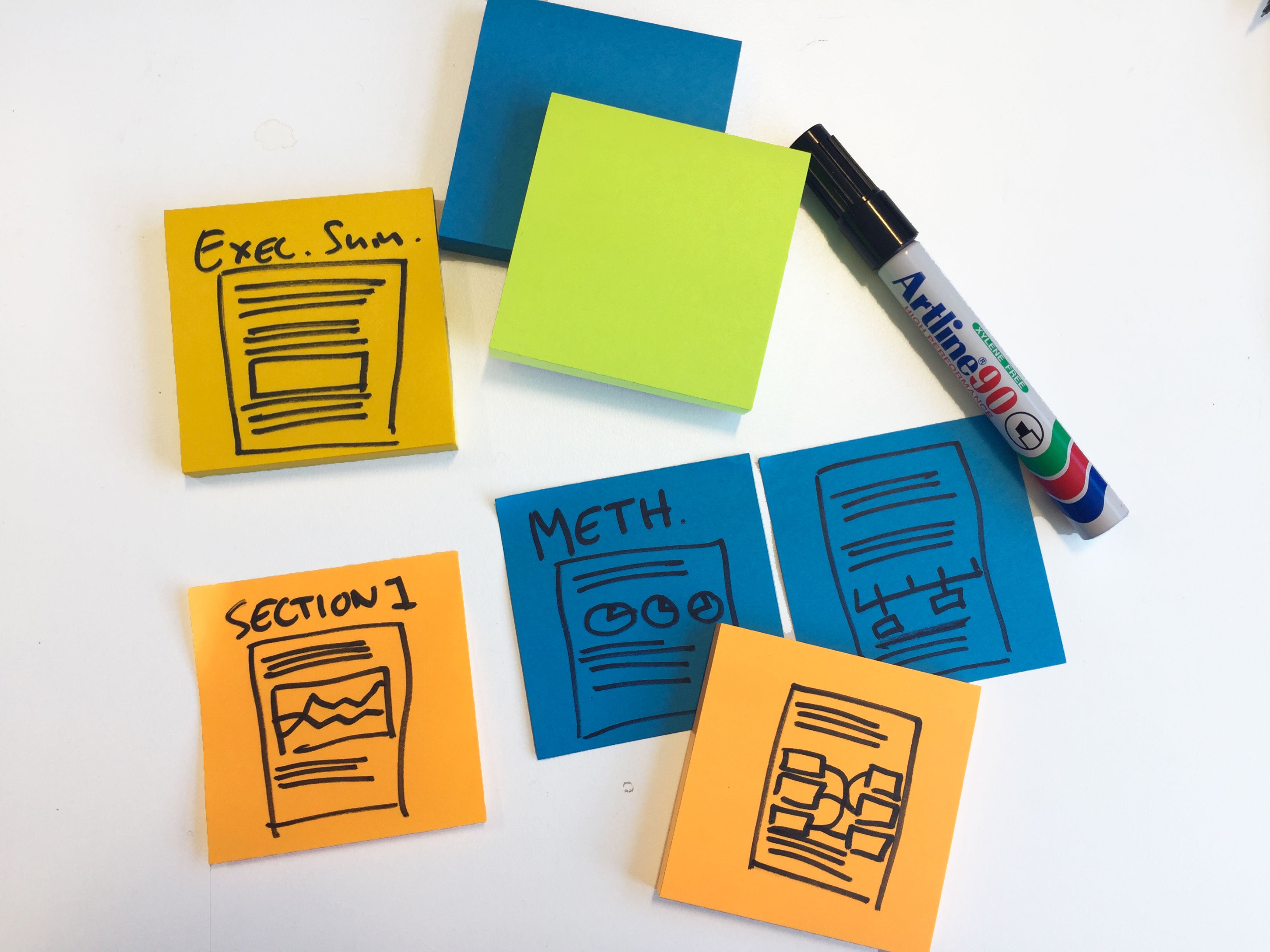
Storyboarding can help you see how the key elements of your report will fit together.
Start a fresh document
This is especially useful if you’ve got a draft floating around between a number of people that’s been weighed down by multiple rounds of edits and comments. It can be a bit of a mentally freeing exercise to move away from this document and start pasting the content you want to keep into a fresh new document – accepting agreed changes and deleting resolved comments as you go. As you’ve already reviewed your structure, you can put in your new section headings to make this copy and paste job even easier.
Make use of hierarchical Heading Styles
Anne K. Emery recommends customising Heading Styles as part of her tips for putting the final touches on a report. I’d strongly advise not waiting until the end of your editing process to set these up and instead using these consistently during the editing process. One big advantage of these is that, in Microsoft Word, headings styled as a Heading Style will show in the document navigation pane, which can be a very useful tool for keeping your new structure on track as you edit your report. You can also drag and drop a heading up and down to move all the content under this style to a different part of the document (e.g. if you move an H2 heading, all H3 or ‘Normal’ styled text below this heading will also move), which is less cumbersome than cutting and pasting multiple pages.
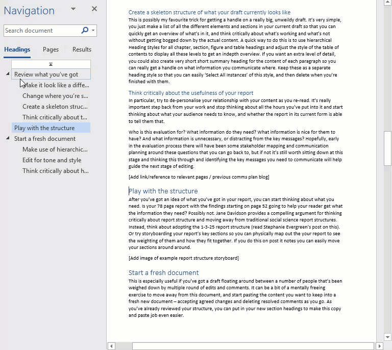
Dragging and dropping from the navigation pane is a quick way to restructure a report - just make sure you've got all your headings in an appropriate Heading Style.
Edit for tone and style
I find it useful to do this at the same time as pasting in the content under the headings of the new structure, because I like the mental distinction between the rough document and the new document where nothing is put in unless it’s reader-friendly – but doing this in one swoop at the end may work better for you. What’s essential is that you are thinking about the effect you want your content to have on your reader when you write this, and who your audience is. I find it useful to keep a mental image of this reader in my head as I’m editing – it changes from document to document, but they’re typically behind a desk piled high with documents to read or reading on a laptop during a commute. They’re very busy and don’t have a lot of time to process new jargon or convoluted sentences, so I make sure to cut these down and explain key terms in the text. Usually, the reader is quite interested in the subject matter generally, but won’t necessarily be so engaged by the nitty-gritty details, so if there’s an important message in a section that they’re likely to glaze over I know I’m going to have to really work on to make sure this is clear, concise and accessible. There are a number of guides to writing in plain English, including the UK’s Plain English Campaign website and the US’ PlainEnglish.gov website (if anyone has any recommendations for non-English plain-language guides, please leave them as a comment below!).
Think critically about how to make your key messages stand out
Despite all your improvements to the text and writing style, your busy reader is still likely to try and skim through this document. Try not to think of this as a negative and instead think of ways to make your key messages jump out of the page and hook the reader in. Dataviz, such as graphs, pull quotes, images can all help with this. You can view our Visualise Data task page for some options for this, or view Stephanie Evergreen’s blog for more inspiration (such as using columns or visualising qualitative information).
Reflect and add the final touches
Is your report in a better place now to engage and inform your intended audience? This might be a good time to pass it to a colleague to get their thoughts on how well you managed to communicate your key messages (and to check that their eyes don’t start to glaze over when reading it). When you’re happy with your draft it’s now time to head back to Anne K. Emery’s blog and add the final touches and run it past the Report Layout Checklist.
What are your tips?
I’d love to hear some more tips and tricks for report editing. Post your ideas and favourite resources.
'Editing reports for an audience' is referenced in:
Blog